.jpg)


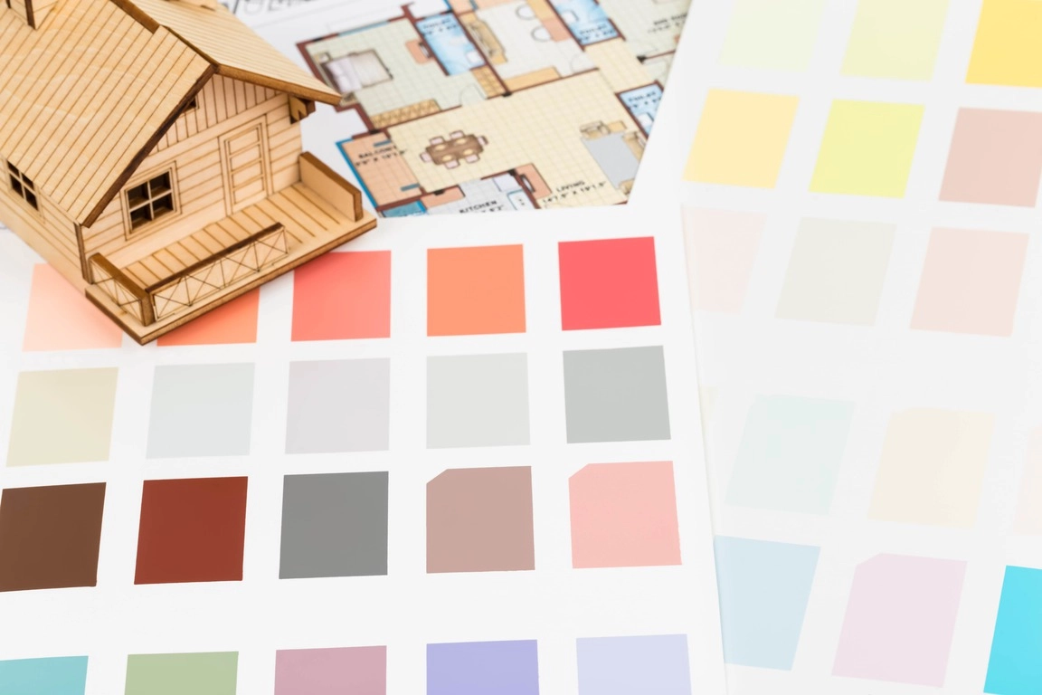
Colorado's high-altitude, high-UV light changes how a paint color reads compared with a lower, hazier climate, which is why a color that looks right in a showroom under fluorescent light can look colder or brighter once it is on a Front Range wall. Choosing color for a Colorado home means testing under the home's actual light before committing to a full room.
How does Colorado's high-altitude light change how paint color looks indoors?
Denver's thinner atmosphere and close to 300 days of sun a year send more direct, less diffused light through windows than a cloudier or lower-elevation climate does, which makes cool colors read colder and warm colors read brighter than a paint chip suggests. Test a sample on the actual wall across a full day before committing.
What interior paint colors sell fastest in the Denver metro?
Warm neutrals such as greige, soft taupe, and light warm white consistently test well with Front Range buyers because they photograph well under strong natural light and let a buyer picture their own furniture in the room. Kitchens and bathrooms benefit from a slightly warmer white than the rest of the home, since Colorado's bright daylight can make a stark white read clinical.
Does exterior paint color need HOA approval in Colorado?
Yes, in most Front Range HOA and metro district communities. Submit the exact color and sheen for architectural review before purchasing paint; a color rejected after the purchase means buying paint twice and delaying the project.
What exterior colors hold up best against Colorado's UV and hail?
Darker exterior colors absorb more UV and show fading faster under Colorado's high-altitude sun than mid-tone or lighter colors do, and a 100% acrylic exterior paint in any color resists chalking better than a lower-grade product. Hail does not discriminate by color, but a lighter color hides minor surface scuffing from hail impact better than a dark, glossy finish.
How does a room's window orientation affect paint color choice in Colorado?
A south- or west-facing Front Range room gets strong, warm afternoon light for most of the year and can handle a cooler paint color without feeling flat; a north-facing room gets consistent, cooler light and benefits from a warmer color to avoid feeling dim. Test the sample at the time of day the room gets used most.
Should a seller test paint colors before committing to a full room?
Yes, always, and in Colorado specifically because the intensity of natural light shifts a color more than in most markets. Paint a sample patch on two or three walls and view it in morning, midday, and evening light before ordering the full room's paint.
Does a bold accent wall help or hurt resale in a Front Range home?
A single, well-placed accent wall in a low-traffic room, such as a dining room or a bedroom's headboard wall, adds character without hurting resale. Bold color across an entire main living space or kitchen narrows the buyer pool and is one of the more common pre-listing repaint requests agents make.
What paint finish works best for Colorado's dusty, dry conditions?
Eggshell or satin finishes wipe clean more easily than flat paint, which matters in a climate with regular dust from dry conditions and open windows during mild stretches. A local Steadfast Painting crew can advise on the right finish room by room; you are free to use any painting contractor.
How many paint colors should run through a Colorado home for the best resale flow?
Two to three complementary neutral tones across the main living spaces, with a single, consistent trim color throughout, gives a Front Range home a cohesive flow that shows well in listing photos and in person. More than three main colors reads busy and can make a smaller home feel choppy.
Does paint color affect a home's listing photos under Colorado sun?
Yes. Strong natural light exaggerates color saturation in photos more than it does in person, so a color that looks balanced walking through the home can look oversaturated in a photo taken at midday. Professional listing photographers shoot around Colorado's harsh midday light for this reason.
Does exterior trim color matter as much as the main body color?
Yes. Trim frames windows, doors, and roofline details in every listing photo, and a crisp, well-maintained trim color reads as upkeep even on a modest main body color. White and warm gray trim both hold up visually against Colorado's strong UV without the stark contrast of true black, which can show dust and hard-water spotting near gutters and downspouts.
Does front door color make a measurable difference in Colorado?
A well-chosen front door color is one of the lowest-cost, highest-visibility changes a Front Range seller can make, since it is the focal point of nearly every listing photo and the first thing a buyer sees on a tour. A saturated but not garish color such as a deep blue, forest green, or warm red-brown tests well across the Denver metro without narrowing the buyer pool the way it can on a full exterior body color. Repaint the door as one of the last pre-listing steps, after siding and trim work are finished, so overspray and dust from earlier work do not mark the fresh finish.
| Room type | Recommended tone | Colorado light note |
|---|---|---|
| Main living spaces | Warm neutral (greige, soft taupe) | Reads balanced under both direct sun and shade |
| Kitchens and bathrooms | Warm white, not stark white | Avoids a clinical look under bright daylight |
| North-facing rooms | Warmer, richer neutral | Offsets consistently cooler, flatter light |
Where to go next
- Preparing and Adding Value Before Selling
- Get a Smart Pricing Report for your Colorado home
- How Fresh Interior Paint Can Increase Buyer Interest Before Listing a Home
- Flat vs. Satin: Which Exterior Paint Finish Is Right for Your Home
- Search every home for sale in Colorado
Talk to the Kenna Real Estate Group
The Kenna Real Estate Group helps Front Range sellers choose paint colors that photograph well under Colorado light and appeal to the widest buyer pool. Call or text 303-955-4220. A live person answers. Not a robot, not a phone tree. Or search every home for sale in Colorado.
Homes for sale that match this post
- Special Districts Property Tax Guide in Denver
- HOA Rules and Fees Guide in Denver
- Homes with Gourmet Kitchen in Denver
- Pool: guide
- All homes for sale in Denver
Guides
Questions about any home in Colorado? Call or text 303-955-4220. A live person answers.